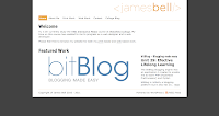
I have chosen to do my competitive analysis on James Bell's portfolio.
The homepage has a brief welcome message which sums up the purpose of the site and a slideshow of featured work which makes the page more interesting and invites users to click the links and find out more (or click the pictures themselves to find our more about that particular project). It loads within seconds and sets the right tone for a site that is clearly a showcase for this student's work during his time on the HND in Interactive Media. There are, however, a couple of typographic errors which stand out and could do with being corrected to improve the overall impact of the homepage.
Navigation is consistent, using the same navigational bar along the top of each page. All links are functional and go to the right page, including those to external sites. All pictures are clickable and allow the user to learn more about each project. External links are used where appropriate. There are no local links but the site doesn't really need any as most pages don't exceed more than one viewport. The only page that does go over the foldline is the web work page, but as it only covers two viewports there isn't too much scrolling.
The site is well organised with the pages appearing in a logical order on the navigation bar. The basic layout of the site makes for easy reading and it keeps the pages compact to minimise whitespace on each page. However, there is a lot of whitespace surrounding some pages, particularly the about me page. Also, the information on this page is the same as that in the welcome message on the homepage. This makes the about me page seem a bit pointless, and to improve it I would either add more information to make the page bigger and eliminate some of the whitespace or remove it from the site.
Labels are clearly laid out in bold and are easy to understand, and headings and subheadings help break up the content and increase readability. Links are informative and make it obvious what they are linking to.
Paragraphs are split into acceptable line lengths and the typeface is easy to read. Dark text on a white background also increases readability.
The site loaded quickly with each page loading within seconds. Content is appropriate for the site and sufficient for its purpose, although there are some typographic errors.
The colour scheme is minimal but this aids readability and is in keeping with the logo in the header. It is consistent throughout.
In summary I think the overall design of James Bell's portfolio is good. It has sufficient content to serve its purpose, i.e. it showcases his work and gives information about each project, clear and easy to follow navigation, logical organisation, it loads quickly, and is easy to read. However, it could be improved by correcting the typographic errors and adding to the about me page thus reducing whitespace. Otherwise I would remove this page as mentioned above, as it performs no real purpose because it gives the same information about the student as that on the homepage.

No comments:
Post a Comment