 I have chosen to do my competitive analysis on Jay Hafling's portfolio.
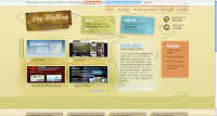
 The homepage is quite creative and informative. Jay's name is quite prominent, both at the top of the page in the sentence next to the search engine and just underneath that within an image, both of which also detail what he does. There is also an image with a brief sentence about him and a link inviting the user to read more, as well as a link to his Twitter, a section about the services he offers and a further section declaring him 'available for freelance' which is again quite prominent. The call to action to 'get in touch' with him doesn't particularly stand out in itself, but the eye is drawn to that section itself and within the paragraph it is clear this is a link as it is underlined and in a different colour.
There are also images of some of his work which can be clicked on to view a bigger image, and a link to view all works. The bottom half of the page has his latest blog posts and beneath that links for people to work their way through the blog archives, which seems to feature on every page. His name, the brief about section and the Twitter section also features on every page as a header, but on other pages it is clearly a separate element of the page while on the home page it blends in with the rest of the page. This is quite useful in allowing users to access these on every page, without having to go back to the homepage to get to his Twitter, etc.
Navigation is consistent, using the same navigational bar along the top of each page. Most links are functional and go to the right page, including those to external sites. There is just one external link in the footer which comes up with page not found. All pictures are clickable and allow the user to view a bigger image. External links are used where appropriate. There are no local links but the site doesn't really need any as most pages don't exceed more than two viewports, with the exception of the wordpress themes page which goes just over. There aren't any excessive amounts of scrolling however.
The site is well organised with the pages appearing in a logical order on the navigation bar. The grid layout of the site makes for easy reading and it keeps the pages compact to minimise whitespace on each page. It also splits up each page into clear sections which also aids readability.
Labels and headings are clearly laid out using larger, bold text and in some cases different colours. These are easy to understand, and immediately identify what each section is about. Subheadings are not required as there are no blocks of text which exceed more than three paragraphs and therefore do not need to be broken up. Links are informative and make it obvious what they are linking to.
Paragraphs are split into acceptable line lengths and the typeface is easy to read. However, much of the site uses white text on a darker background which isn't as easy to read as dark text on a lighter background. This doesn't detract from readability too much as there are no really big blocks of text, but if he were to add more textual content to the site in future it may become an issue. The only instance where the colour of text doesn't contrast with the background particularly well is his name and job title within the image in the header, which uses black text on a dark background. This does make it hard to read and could do with being changed to a lighter colour text to improve readability.
The site loaded quickly with each page loading within seconds. Some of the images did take longer to load however, perhaps about 30 seconds for some of them. Content is appropriate for the site and sufficient for its purpose, although there are some English errors. However, English is presumably not Jay's first language as he says he is from Ukraine and it is good enough to communicate the information to users.
The colour scheme is effective and uses colours that work well with each other. It is consistent throughout.
In summary I think the overall design of Jay Hafling's portfolio is good. It has sufficient content to serve its purpose, i.e. it showcases his work and gives information about himself and what he does, has clear and easy to follow navigation, logical organisation, it loads quickly, and is easy to read. It also allows potential clients to contact him which is important for a freelancer. The main improvement I would make would be to the image in the header with his name and job title, changing the contrast between text and background to make it easier to read.

No comments:
Post a Comment