Tuesday 2 March 2010

Portfolio Final Designs

Here are the final designs for my portfolio. The print work page will be a Lightbox image gallery but the web work page will open up the actual sites in a new window.


Friday 12 February 2010

Initial Portfolio Designs

After some sketchbook work I picked the two designs I felt to be the best to develop further. Feedback would be appreciated to help me choose the best one.


Wednesday 3 February 2010

Website Goals and Delivery Requirements

My goals for the portfolio are as follows:

  • XHTML 1.0 (Strict) and CSS 2.1 Valid

It is important to have a website that validates to W3C standards as this increases crossbrowser compatibility, search engine optimisation (SEO), increases the speed with which pages load and increases accessibility.

To measure this I will use the W3C validator.

  • Easy to update

My portfolio will need to be updated on a regular basis to showcase my latest work. This will be measurable by the ease with which I can add new projects I have worked on.

  • Maximum Possible Search Engine Optimisation

It is important my portfolio ranks as high as possible on search engines to ensure it is viewed by the target audience. To measure this I will type different keywords into search engines on a regular basis to check my site is as near the top as possible.

Delivery Requirements

The markup/scripting languages will be XHTML 1.0 (strict) and CSS 2.1. The domain name will be www.nick-stead.co.uk and it will be hosted by E68.

Thursday 28 January 2010

Portfolio Target Audience

Primary - Tutor

Steve is our course tutor and he will be assessing the portfolio. He is looking for a site that validates to XHTML 1.0 Strict and CSS 2.1 and is creative enough to meet the course standard.

Steve is experienced at using websites and surfing the Internet. Both at home and at work he has a high speed Internet connection and is online frequently. To browse sites he uses his Apple MacBook and the latest version of Mozilla Firefox.

Websites Steve is likely to visit regularly include Apple's site, design related sites, typography related sites, other designer's blogs (he may follow some of these), social networking sites such as Twitter and Facebook, news sites, sport sites, gaming sites (particularly those related to console games such as Playstation), other technology related sites and 'lolcats'. Online purchases include Apple products, console games, other new technologies, design magazines and fonts.

Secondary - Clients and Potential Employers

Potential employers will most likely be experienced at using websites and surfing the Internet. They will also be likely to have high speed Internet connections both at work and at home and be online frequently. To browse sites they are likely to have the latest version of their chosen browser, which would probably be Mozilla Firefox as this is the most standards compliant.

They are likely to visit design related sites, typography related sites, other designer's blogs (they may follow some of these), social networking sites such as Twitter and Facebook, news sites and technology related sites. Online purchases include new technologies, design magazines and fonts.

Clients could be anyone from any business and their experience at using websites and surfing the Internet will vary. Their Internet connections will also vary as will the time they spend online. Tools for browsing sites will also vary, as will the sites they tend to visit. However, if they are looking for a web designer they are likely to view a number of portfolios to help them choose a designer they like.

Online purchases will vary.

Tertiary - Other Students

Students interested in my portfolio are likely to be other web design students looking for inspiration. They are likely to be experienced at using websites and surfing the Internet. They are also likely to have high speed Internet connections both at college/university and at home and be online frequently.

The websites they are likely to visit regularly include design related sites, typography related sites, other designer's blogs (they may follow some of these), social networking sites such as Twitter and Facebook, gaming sites (both console and online games), other web design student's portfolios and blogs, technology related sites, and possibly music and film related sites. Online purchases include new technologies, music, films and games.

Thursday 21 January 2010

Professional Designer's Portfolio Competitive Analysis

I have chosen to do my competitive analysis on Jay Hafling's portfolio.

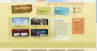
The homepage is quite creative and informative. Jay's name is quite prominent, both at the top of the page in the sentence next to the search engine and just underneath that within an image, both of which also detail what he does. There is also an image with a brief sentence about him and a link inviting the user to read more, as well as a link to his Twitter, a section about the services he offers and a further section declaring him 'available for freelance' which is again quite prominent. The call to action to 'get in touch' with him doesn't particularly stand out in itself, but the eye is drawn to that section itself and within the paragraph it is clear this is a link as it is underlined and in a different colour.

There are also images of some of his work which can be clicked on to view a bigger image, and a link to view all works. The bottom half of the page has his latest blog posts and beneath that links for people to work their way through the blog archives, which seems to feature on every page. His name, the brief about section and the Twitter section also features on every page as a header, but on other pages it is clearly a separate element of the page while on the home page it blends in with the rest of the page. This is quite useful in allowing users to access these on every page, without having to go back to the homepage to get to his Twitter, etc.

Navigation is consistent, using the same navigational bar along the top of each page. Most links are functional and go to the right page, including those to external sites. There is just one external link in the footer which comes up with page not found. All pictures are clickable and allow the user to view a bigger image. External links are used where appropriate. There are no local links but the site doesn't really need any as most pages don't exceed more than two viewports, with the exception of the wordpress themes page which goes just over. There aren't any excessive amounts of scrolling however.

The site is well organised with the pages appearing in a logical order on the navigation bar. The grid layout of the site makes for easy reading and it keeps the pages compact to minimise whitespace on each page. It also splits up each page into clear sections which also aids readability.

Labels and headings are clearly laid out using larger, bold text and in some cases different colours. These are easy to understand, and immediately identify what each section is about. Subheadings are not required as there are no blocks of text which exceed more than three paragraphs and therefore do not need to be broken up. Links are informative and make it obvious what they are linking to.

Paragraphs are split into acceptable line lengths and the typeface is easy to read. However, much of the site uses white text on a darker background which isn't as easy to read as dark text on a lighter background. This doesn't detract from readability too much as there are no really big blocks of text, but if he were to add more textual content to the site in future it may become an issue. The only instance where the colour of text doesn't contrast with the background particularly well is his name and job title within the image in the header, which uses black text on a dark background. This does make it hard to read and could do with being changed to a lighter colour text to improve readability.

The site loaded quickly with each page loading within seconds. Some of the images did take longer to load however, perhaps about 30 seconds for some of them. Content is appropriate for the site and sufficient for its purpose, although there are some English errors. However, English is presumably not Jay's first language as he says he is from Ukraine and it is good enough to communicate the information to users.

The colour scheme is effective and uses colours that work well with each other. It is consistent throughout.

In summary I think the overall design of Jay Hafling's portfolio is good. It has sufficient content to serve its purpose, i.e. it showcases his work and gives information about himself and what he does, has clear and easy to follow navigation, logical organisation, it loads quickly, and is easy to read. It also allows potential clients to contact him which is important for a freelancer. The main improvement I would make would be to the image in the header with his name and job title, changing the contrast between text and background to make it easier to read.

Thursday 14 January 2010

Portfolio Competitive Analysis


I have chosen to do my competitive analysis on James Bell's portfolio.

The homepage has a brief welcome message which sums up the purpose of the site and a slideshow of featured work which makes the page more interesting and invites users to click the links and find out more (or click the pictures themselves to find our more about that particular project). It loads within seconds and sets the right tone for a site that is clearly a showcase for this student's work during his time on the HND in Interactive Media. There are, however, a couple of typographic errors which stand out and could do with being corrected to improve the overall impact of the homepage.

Navigation is consistent, using the same navigational bar along the top of each page. All links are functional and go to the right page, including those to external sites. All pictures are clickable and allow the user to learn more about each project. External links are used where appropriate. There are no local links but the site doesn't really need any as most pages don't exceed more than one viewport. The only page that does go over the foldline is the web work page, but as it only covers two viewports there isn't too much scrolling.

The site is well organised with the pages appearing in a logical order on the navigation bar. The basic layout of the site makes for easy reading and it keeps the pages compact to minimise whitespace on each page. However, there is a lot of whitespace surrounding some pages, particularly the about me page. Also, the information on this page is the same as that in the welcome message on the homepage. This makes the about me page seem a bit pointless, and to improve it I would either add more information to make the page bigger and eliminate some of the whitespace or remove it from the site.

Labels are clearly laid out in bold and are easy to understand, and headings and subheadings help break up the content and increase readability. Links are informative and make it obvious what they are linking to.

Paragraphs are split into acceptable line lengths and the typeface is easy to read. Dark text on a white background also increases readability.

The site loaded quickly with each page loading within seconds. Content is appropriate for the site and sufficient for its purpose, although there are some typographic errors.

The colour scheme is minimal but this aids readability and is in keeping with the logo in the header. It is consistent throughout.

In summary I think the overall design of James Bell's portfolio is good. It has sufficient content to serve its purpose, i.e. it showcases his work and gives information about each project, clear and easy to follow navigation, logical organisation, it loads quickly, and is easy to read. However, it could be improved by correcting the typographic errors and adding to the about me page thus reducing whitespace. Otherwise I would remove this page as mentioned above, as it performs no real purpose because it gives the same information about the student as that on the homepage.

Thursday 19 November 2009

Stress Free

The second year is well underway and so far I’ve found it a lot less stressful than the first. I’ve passed the first two assignments which is a relief, particularly as I was worried about the SMLP and having to learn a scripting language on my own. I’ve also met deadlines without having to stay up half the night to get everything done which is an improvement on last time round.

I’m currently working on A10 which is all about the reverse design process (designing for an unknown product) and A11 which is about Wordpress.

As with the SMLP, I had doubts about A10 as my creativity is often lacking and thought I’d struggle to fill page after page with designs. However this has not been the case. While there have been some dry spells, I’ve successfully managed to produce some 20 pages of varied ideas which should be ample to choose from when we’re given a product. I handed this in a week early as I will be away for two weeks and miss the official deadline, but even with doing the extra work to make up for missing a week I didn’t find this exercise nearly as stressful as I thought I might.

A11 is also going fairly well so far. I’ve just about got the basic structure of my site and now all I need is to get my head round templates and such in Wordpress. I’ll be concentrating more on A11 this week as I devoted last week to A10 and I’m confident I can pull ahead with this as well to give myself less work to do when I come back.

So in summary the second year seems to be running a lot smoother for me than the first and hopefully this will continue throughout.