To say I was looking forward to some creative work, today’s activity (ideas generation) left me feeling frustrated and slightly out of my depth.
Thumbnailing was ok, but I started to have doubts developing them, feeling a bit lost as to what measurements to state. Then it came to the final design and everything seemed to go wrong.
I would consider myself to be good at maths but I struggled somewhat to work out the measurements. Then when I thought I’d worked it out I began to draw the page, only to realise I’d mixed up the measurements for the gutter with the margins! I’m definitely going to have to go back to it in self study time and work through it again.
Writing this blog now, the frustration’s already ebbing away and I know I will perfect this skill in time. And despite my initial misgivings, it was good to finally start some creative work.
As for A4 and A3, I feel confident so far. I’m not worried about the typography test either. While I don’t feel ready to undertake it yet I know I will be prepared when the time comes. Nor am I worried about the mini-assignments we will have to do for A4, the first of which is due next week.
I just hope I get the internet back soon since we’re still not connected at home. I’m slightly worried if it doesn’t get sorted I’ll fall behind, but at least I’ve found a nearby pub with wi-fi where I can take the MacBook to get my work done.
I have to say overall I’m still confident in my studies and still feel I’m on the right path to becoming a web designer. It will be a long journey but I’ll get there in the end.
Tuesday, 25 November 2008
Tuesday, 11 November 2008
Meanwhile, out in the real world...
Yesterday we were fortunate enough to meet Dave Pannell and Craig Burgess, who talked to us about Dave’s company The Design Mechanics. It was really interesting to hear how Dave handles design as a business, and he stressed the importance of remembering to treat it as such. I felt this was a really important point because at the end of the day it is a business just like any other, and simply being creative isn’t enough.
It also gave me an idea of the kind of timescales you have to work in, something which it sounds like we’ll be getting a lot of experience on in the upcoming weeks.
Interesting as well was how the recession is affecting the business, and how they are dealing with it. I thought they would be struggling so I was surprised to hear that they are actually swamped with work, though from the talk I can now see why.
Another highlight for me was Dave’s experience of running a business. I have given some thought to eventually starting my own business, though I was planning on working for a company first and saving up. However, after hearing the problems Dave has had in the past I may well just stick to working for a company.
I think I will really benefit from what was said about handling clients too, especially when I actually get out into the working world. Craig’s advice about finding freelance work and starting to make a name for yourself whilst studying was also really helpful.
Looking at some examples of the kind of design work produced was also interesting and inspirational.
Overall I really enjoyed the talk, and would certainly be interested in working for Dave after this course. So to finish I’d just like to say thanks again guys.
Tuesday, 4 November 2008
Copperplate Gothic
Copperplate Gothic was originally designed in 1901 by Frederic W. Goudy for America Type Founders (ATF)1. Its name comes from the technique copperplate engraving, which was popular for reproducing illustrated material between 1530 and the 1800’s2. An unusual combination of influences can be seen within this typeface: the glyphic serifs come from stone carving, while the wide horizontal axis is similar to that of Victorian display types3.

Copperplate Gothic Thirty AB

Copperplate Gothic Thirty BC

Copperplate Gothic Thirty-One AB

Copperplate Gothic Thirty-One BC

Copperplate Gothic Thirty-Two AB

Copperplate Gothic Thirty-Three BC

It was originally intended to be used in stationary and society printing, but is now used in a wide range of commercial printing1. At first the font appears to be a sans serif font, though each character actually has a tiny, pointy serif which gives it a more distinctive feel. This makes it a very popular choice for use on business cards2. It is also often used for the frosted glass lettering on office doors (typically those of lawyers and private investigators) and in advertisement1.
Some examples of commercial use of Copperplate Gothic:
Remembrandt logo and packaging
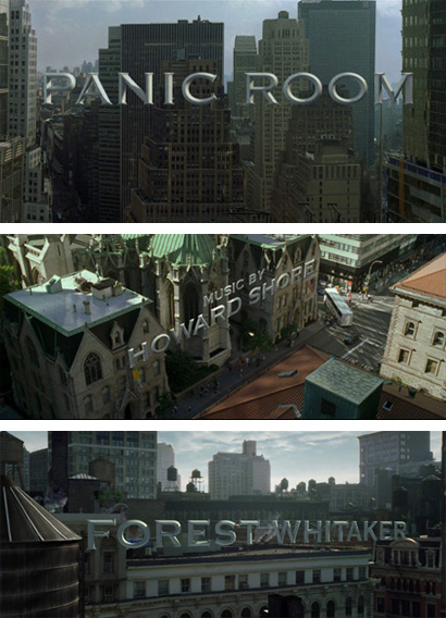
Opening credits for the film Panic Room
Screenshot from the film Ratatouille
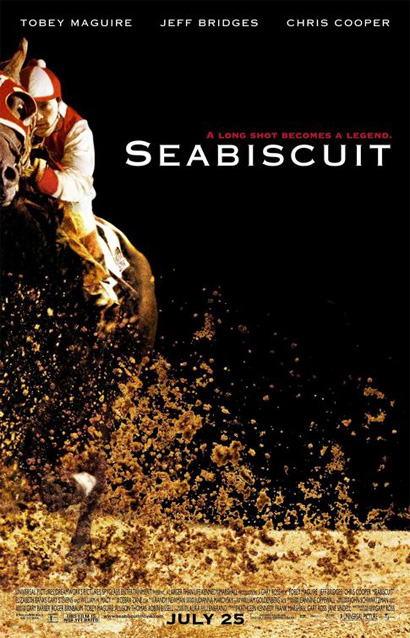
Poster for the film Seabiscuit
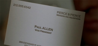
Business card belonging to the character Paul Allen in American Psycho
References
1. http://www.adobe.com/
2. http://www.microsoft.com/typography/fonts/family.aspx?FID=40
3. http://en.wikipedia.org/wiki/Copperplate_Gothic
4. http://www.underconsideration.com/speakup/archives/003819.html
5. http://www.myfonts.com/fonts/linotype/copperplate-gothic/
This Linotype font family (now bundled into most Macs and PCs4) has 9 different styles5, all of which can be seen below. There is no true lowercase for this font – simply capitals and smaller capitals. That is to say this is an all-capital font, where the AB and BC in the name of each style refers to the relative sizes of the capitals and small capitals1.
5Samples of the 9 different styles of Copperplate Gothic:
Copperplate Gothic Twenty-Nine AB

Copperplate Gothic Twenty-Nine BC
5Samples of the 9 different styles of Copperplate Gothic:
Copperplate Gothic Twenty-Nine AB

Copperplate Gothic Twenty-Nine BC

Copperplate Gothic Thirty AB

Copperplate Gothic Thirty BC

Copperplate Gothic Thirty-One AB

Copperplate Gothic Thirty-One BC

Copperplate Gothic Thirty-Two AB

Copperplate Gothic Thirty-Two BC


Copperplate Gothic Thirty-Three BC

It was originally intended to be used in stationary and society printing, but is now used in a wide range of commercial printing1. At first the font appears to be a sans serif font, though each character actually has a tiny, pointy serif which gives it a more distinctive feel. This makes it a very popular choice for use on business cards2. It is also often used for the frosted glass lettering on office doors (typically those of lawyers and private investigators) and in advertisement1.
Some examples of commercial use of Copperplate Gothic:
Remembrandt logo and packaging
Opening credits for the film Panic Room
Screenshot from the film Ratatouille
Poster for the film Seabiscuit
Business card belonging to the character Paul Allen in American Psycho
References
1. http://www.adobe.com/
2. http://www.microsoft.com/typography/fonts/family.aspx?FID=40
3. http://en.wikipedia.org/wiki/Copperplate_Gothic
4. http://www.underconsideration.com/speakup/archives/003819.html
5. http://www.myfonts.com/fonts/linotype/copperplate-gothic/
Subscribe to:
Comments (Atom)
