This Linotype font family (now bundled into most Macs and PCs4) has 9 different styles5, all of which can be seen below. There is no true lowercase for this font – simply capitals and smaller capitals. That is to say this is an all-capital font, where the AB and BC in the name of each style refers to the relative sizes of the capitals and small capitals1.
5Samples of the 9 different styles of Copperplate Gothic:
Copperplate Gothic Twenty-Nine AB

Copperplate Gothic Twenty-Nine BC
5Samples of the 9 different styles of Copperplate Gothic:
Copperplate Gothic Twenty-Nine AB

Copperplate Gothic Twenty-Nine BC

Copperplate Gothic Thirty AB

Copperplate Gothic Thirty BC

Copperplate Gothic Thirty-One AB

Copperplate Gothic Thirty-One BC

Copperplate Gothic Thirty-Two AB

Copperplate Gothic Thirty-Two BC


Copperplate Gothic Thirty-Three BC

It was originally intended to be used in stationary and society printing, but is now used in a wide range of commercial printing1. At first the font appears to be a sans serif font, though each character actually has a tiny, pointy serif which gives it a more distinctive feel. This makes it a very popular choice for use on business cards2. It is also often used for the frosted glass lettering on office doors (typically those of lawyers and private investigators) and in advertisement1.
Some examples of commercial use of Copperplate Gothic:
Remembrandt logo and packaging
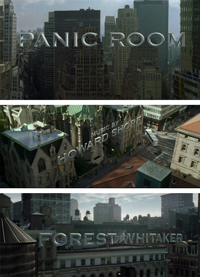
Opening credits for the film Panic Room
Screenshot from the film Ratatouille
Poster for the film Seabiscuit
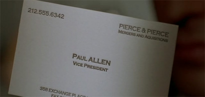
Business card belonging to the character Paul Allen in American Psycho
References
1. http://www.adobe.com/
2. http://www.microsoft.com/typography/fonts/family.aspx?FID=40
3. http://en.wikipedia.org/wiki/Copperplate_Gothic
4. http://www.underconsideration.com/speakup/archives/003819.html
5. http://www.myfonts.com/fonts/linotype/copperplate-gothic/

6 comments:
Hey Nick. Looks good. Like the American Psycho link.
Hello again Nick.
Bit more critical feed back for you.
I think the piece is well researched and flows very well with a lot of interesting snippets of information.
Just a few minor things though.
Your link for American Psycho goes to the Seabiscuit poster.
One of the superscript numbers has a space next to it. (Number 5)
And could the titles of the the images not sit above rather than next to?
Hope this help fella.
Regards,
Sam
Hi Nick,
I echo what Sam says in relation to the pictures with the fixed column you have used for your body text you should be able to line up the writing to either sit at the side; above or below the pictures and not over a couple of lines.
I think the content of your entry is great and so is the range of sources you have used.
My final question would be does the lack of superscript numbers in the final paragraph mean this is all your own words?
Hi Nick,
This piece looks fantastic, well researched and very informative.
Unfortunately I have to agree with Sam regarding your image titles. Personally, I also think they would have looked better above or below the examples.
Well done mate, it looks great.
Regards,
Brad
Hi Nick,
Well written post without any problems other than those relating to the images.
The titles are a little too techy, though I see why you have used them. Moreover, they would go better below the image or above. However, I know you had a lot of problems with that so I wouldn't worry too much.
Well done.
Hi Nick,
Really enjoyed reading your entry on "Copperplate Gothic" as it's one of my favourite fonts. A great deal of effort has gone into the research and your entry has been very well written.
Layout wise, I'm not sure that you need double spacing between the paragraphs, I think a single line should suffice. However this is more a personal preference than an actual grumble.
As previously mentioned, I think you need to go back and reformat the text used next to your examples of the font style. I believe this will be more pleasing on the eye and finish of your hard work perfectly.
All the best,
Ian
Post a Comment